Dog Food and New Shoes: The Story Behind Alloy's Brand Refresh

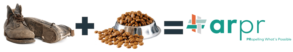
There’s an old adage that the cobbler’s children always need new shoes. Then there’s the adage that one of my mentors is fond of saying, “you need to eat your own dog food.” Combined, those two adages couldn’t be truer for marketing, branding and PR firms. Many agencies get lost in the hustle and ignore their own brands’ creative look, feel and assets. Always the cobbler’s children. But as an agency, there’s great value in eating our own dog food – in practicing our craft on ourselves, as well as on our clients.
So, when the Alloy leadership team tossed around the idea of undergoing a brand refresh, we took the process to heart, with as much care and thoughtfulness that we would give to a client’s brand initiative. We even debated changing the company’s name altogether. We debated finer points like uppercase and lowercase fonts. We hired vendors. We gave those vendors feedback. Sometimes the process was heated. Sometimes it was utterly frustrating. Sometimes we laughed from zany ideas that despite my insistence – should never be brought to fruition.
We went through the same process that we put clients through when developing creative campaigns. We ate the same dog food that we manufacture, and in the end, we got a new pair of shoes.
 In two months, Alloy will celebrate our fifth birthday. With a 45% YoY growth rate, a client roster of global leaders, an innovative service approach, and one helluva team, we needed a logo and tagline that matched our evolution. First, we crafted our new tagline, PRopelling What’s Possible. It perfectly sums up how we consistently push the limits of what a PR agency can achieve.
Then, we were able to weave (pun intended) key themes into the cross stitch-like logo emblem.
We’re out of the box. You can argue that we were never in the box to begin with. And what’s the most out of the box thing there is? A flattened box. If you lay a box completely out, you’ll see four perpendicular lines, which make up the seams of the box.
Four perpendicular lines also happen to form a hashtag. The hashtag is near and dear to our hearts. Our first tagline was #MAKENEWS, we’re a digital-forward PR agency and we’re totally trending.
The four colored lines represent the four core service offerings that built this agency: media relations, social media, content marketing and lead gen. They’re carefully woven together in our emblem to reflect our integrated approach.
There’s a reason that people on the receiving end of a trust fall lay their arms in a perpendicular pattern - it’s a strong formation. If one line gets stretched or one intersection breaks, the grid remains intact so the show goes on. Our team is strong, it’s supportive and it’s connected - it’s so special it needed a logo in its likeness.
I hope you’ll take a few minutes today to explore our refreshed website to see our new logo, color palette and fonts in-action. Special thanks to Friendly Human, Eastmont Group, our in-house designer Casey Zintel, our ‘keeper of the brand’ and SVP Blair Broussard, our messaging guru and VP of Client Service Evan Goldberg, and our VP of Analytics and Digital Marketing Renee Spurlin. And of course, tremendous thanks to our clients – the dogs who eat our food and come to us to fix their shoes. We continue to be inspired, energized and grateful for our relationship with you.
- Anna Ruth
P.S. Come visit us in our new Atlanta headquarters, Suite 9800 in Ponce City Market. As I type this, we’re unpacking boxes, but our new logo will be plastered on the walls soon, and we’d love to give you a beer and a tour.
:quality(80))
:quality(80))
:quality(80))
:quality(80))
:quality(80))
:quality(80))
:quality(80))
:quality(80))
:quality(80))
:quality(80))

